Introduction
Next to last tip no.9!
#9 Customize your Toolbar
As the previous blog entries mentioned, the interactive grid brings many out-of-the-box features on the one hand, but also many adjustments that can be made on the other. This means it is possible for the developer to customize the toolbar the way the customer wants. This article shows some examples of how you can customize the interactive grid Toolbar without much effort.
Know your toolbar
Before we can start, however, we should understand how the toolbar is structured.

As you can see in the figure, the toolbar consists of seven different menu groups (arrays) that can all be customized individually. In our example we will first hide all menu groups and then only the "action1" menu group will be customized and displayed.
Let´s start
Let's start with a new application or page where we will add an interactive grid. In our example we use the table "EMP" as source. The toolbar of the interactive grid can be customized via JavaScript. For this we have to add some JavaScript Initialization Code under the attributes of the IG. First we will hide the unneeded menu groups and locate the menu group "actions1" that we want to customize.
function(config) {
    var $ = apex.jQuery,
    // Make a copy of the default toolbar
    toolbarData = $.apex.interactiveGrid.copyDefaultToolbar(),
    // Remove the search menu group
    toolbarGroup = toolbarData.toolbarRemove("search");
    // Remove the reports menu group
    toolbarGroup = toolbarData.toolbarRemove("reports");
    // Remove the views menu group
    toolbarGroup = toolbarData.toolbarRemove("views");
    // Remove the actions2 menu group
    toolbarGroup = toolbarData.toolbarRemove("actions2");
    // Remove the actions3 menu group
    toolbarGroup = toolbarData.toolbarRemove("actions3");
    // Remove the actions4 menu group
    toolbarGroup = toolbarData.toolbarRemove("actions4");
    // Locate the actions menu group
    toolbarGroup = toolbarData.toolbarFind("actions1");

    // Add new control elements here

    // Assign new toolbar data back to toolbarData configuration property
    config.toolbarData = toolbarData;
    // Return the config
    return config;
}
After we have done that and started the application, we see that we have created an IG with a blank toolbar. The next step is to add some elements to the toolbar.
Add a button
The most common element is probably the button. Let's add some button to the toolbar first.
The structure is always the same. We declare a type, label, icon and an action to be executed.
// Add new buttons
// Note the toolbar is action driven, so we just need to define the correct action name with the button.
toolbarGroup.controls.push({
    type: "BUTTON",
    label: "Add Row(s)",
    action: "selection-add-row",
    icon: "icon-ig-add-row",
    iconBeforeLabel: true,
    hot: true
});

toolbarGroup.controls.push({
    type: "BUTTON",
    label: "Delete Row(s)",
    action: "selection-delete",
    icon: "icon-ig-delete",
    iconBeforeLabel: true,
    hot: true
});

toolbarGroup.controls.push({
    type: "BUTTON",
    label: "Save",
    action: "save",
    icon: "icon-ig-save",
    iconBeforeLabel: true,
    hot: true
});
There are many default widgets for the interactive grid that we can use. For a complete reference, see the list below.

In our case we use the "Add Row", "Delete Row" and "Save Changes" action as an example, but we can also define and execute our own custom actions or trigger Dynamic Actions or an AJAX process. The next code snippet shows you how you can directly execute a JS command or trigger a Dynamic Action. Note that you have to create the custom Dynamic Action, too.
toolbarGroup.controls.push({
    type: "BUTTON",
    label: "My Button",
    icon: "fa fa-american-sign-language-interpreting",
    iconBeforeLabel: true,
    hot: true,
    action: "my_action"
});

toolbarGroup.controls.push({
    type: "BUTTON",
    label: "My DA Button",
    icon: "fa fa-play",
    iconBeforeLabel: true,
    hot: true,
    action: "my_da"
});

config.initActions = function(actions){
    actions.add({
        name: "my_action",
        action: function() {
        alert('Hello World');
        }
    });
    actions.add({
        name: "my_da",
        action: function() {
        $.event.trigger('my_da');
        }
    });
}
Now our toolbar should look like this.

Add as select-list
Our next step in customizing the toolbar will be to add a select-list. To do this, we follow the same procedure as before and add another control element which is of type "SELECT".
// Add new select-list
toolbarGroup.controls.push({
    type: "SELECT",
    title: "Select",
    id: "my_select",
    action: "my_select_action"
});
Again, we need to also create a custom action to add values to the Select List and an event to be triggered.
actions.add({
    name: "my_select_action",
    choices: [{ label: "All Jobs", value: "" },
              { label: "President", value: "PRESIDE" },
              { label: "Manager", value: "MANAGER" },
              { label: "Analyst", value: "ANALYST" },
              { label: "Clerk", value: "CLERK" },
              { label: "Salesman", value: "SALESMAN" }
    ],
    action: function(event, focusElement) {
        var e = document.getElementById("my_ig_ig_toolbar_my_select"),
        value = e.options[e.selectedIndex].value;
        apex.item( "P1_JOB" ).setValue(value);
    }
});
Here we create a list of the jobs and save the value in an item (P1_JOB). Now we can work with this value and, for example, filter our interactive grid.
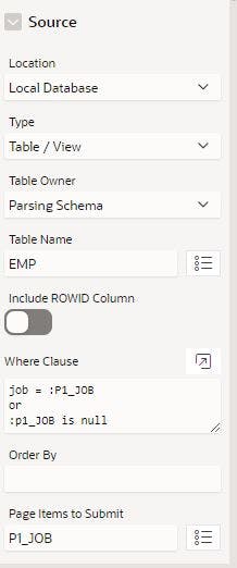
For this we create a hidden item which we also call "P1_JOB" and also a new "Change" Dynamic Action for that item. After that, we add a "True" action to refresh the grid. Finally adjust the WHERE clause of the grid and pick P1_JOB to "Page Items to Submit"

Now our toolbar should look like this and we can filter our IG by selecting a value from the Select List.

Add a menu
Finally we are going to add a menu to the toolbar.
For this, we need a new control element of type "MENU". That is the easy part because we already know how to do it. However, defining the menu items is a little bit harder. Each entry has its own type, action, label and other options that we can define. Note: each additional entry needs a separator first.
In our example, we'll use the "Highlight" and "Download" pre-defined action, plus two other custom actions that will trigger an alert.
// Add a Menu to the toolbar
toolbarGroup.controls.push({type: "MENU",
    id: "my-menu",
    label: "My Menu",
    icon: "fa fa-navicon",
    iconBeforeLabel: true,
    hot: false,
    action: "custom-menu",
    // Add Menu Items (each additional entry needs a separator)
    menu: {
        items: [{
            type: "action",
            action: "show-highlight-dialog",
            label: "Highlight"
        }, {
            type: "separator"
        }, {
            type: "action",
            action: "show-download-dialog",
            label: "Download"
        }, {
            type: "separator"
        }, {
            type: "action",
            action: function(){ alert('Action 1');},
            label: "Action 1",
            icon: "fa fa-number-1-o"
        }, {
            type: "separator"
        }, {
            type: "action",
            label: "Action 2",
            action: function(){ alert('Action 2');},
            icon: "fa fa-number-2-o"
        }]
    }
});
So thats it. Your toolbar should now look like this.

The finished JavaScript Code should be the following:
function(config) {
    var $ = apex.jQuery,
    toolbarData = $.apex.interactiveGrid.copyDefaultToolbar(),  // Make a copy of the default toolbar
    toolbarGroup = toolbarData.toolbarRemove("search");         // Remove the search menu group
    toolbarGroup = toolbarData.toolbarRemove("reports");        // Remove the reports menu group
    toolbarGroup = toolbarData.toolbarRemove("views");          // Remove the views menu group
    toolbarGroup = toolbarData.toolbarRemove("actions2");       // Remove the actions2 menu group
    toolbarGroup = toolbarData.toolbarRemove("actions3");       // Remove the actions3 menu group
    toolbarGroup = toolbarData.toolbarRemove("actions4");       // Remove the actions4 menu group
    toolbarGroup = toolbarData.toolbarFind("actions1");         // Locate the actions menu group

    // Add new buttons
    // Note the toolbar is action driven, so we just need to define the correct action name with the button.
    toolbarGroup.controls.push({
        type: "BUTTON",
        label: "Add Row(s)",
        action: "selection-add-row",
        icon: "icon-ig-add-row",
        iconBeforeLabel: true,
        hot: true
    });
    toolbarGroup.controls.push({
        type: "BUTTON",
        label: "Delete Row(s)",
        action: "selection-delete",
        icon: "icon-ig-delete",
        iconBeforeLabel: true,
        hot: true
    });
    toolbarGroup.controls.push({
        type: "BUTTON",
        label: "Save",
        action: "save",
        icon: "icon-ig-save",
        iconBeforeLabel: true,
        hot: true
    });
    toolbarGroup.controls.push({
        type: "BUTTON",
        label: "My Button",
        icon: "fa fa-american-sign-language-interpreting",
        iconBeforeLabel: true,
        hot: true,
        action: "my_action"
    });
    toolbarGroup.controls.push({
        type: "BUTTON",
        label: "My DA Button",
        icon: "fa fa-play",
        iconBeforeLabel: true,
        hot: true,
        action: "my_da"
    });

    // Add new select-list
    toolbarGroup.controls.push({
        type: "SELECT",
        title: "Select",
        id: "my_select",
        action: "my_select_action"
    });

    // Add a Menu to the toolbar
    toolbarGroup.controls.push({type: "MENU",
        id: "my-menu",
        label: "My Menu",
        icon: "fa fa-navicon",
        iconBeforeLabel: true,
        hot: false,
        action: "custom-menu",
        // Add Menu Items (each additional entry needs a separator)
        menu: {
            items: [{
                type: "action",
                action: "show-highlight-dialog",
                label: "Highlight"
            }, {
                type: "separator"
            }, {
                type: "action",
                action: "show-download-dialog",
                label: "Download"
            }, {
                type: "separator"
            }, {
                type: "action",
                action: function(){ alert('Action 1');},
                label: "Action 1",
                icon: "fa fa-number-1-o"
            }, {
                type: "separator"
            }, {
                type: "action",
                label: "Action 2",
                action: function(){ alert('Action 2');},
                icon: "fa fa-number-2-o"
            }]
        }
    });

    config.initActions = function(actions){
        actions.add({
            name: "my_action",
            action: function() {
            alert('Hello World');
            }
        });
        actions.add({
            name: "my_da",
            action: function() {
            $.event.trigger('my_da');
            }
        });
        actions.add({
            name: "my_select_action",
            choices: [{ label: "All Jobs", value: "" },
                      { label: "President", value: "PRESIDE" },
                      { label: "Manager", value: "MANAGER" },
                      { label: "Analyst", value: "ANALYST" },
                      { label: "Clerk", value: "CLERK" },
                      { label: "Salesman", value: "SALESMAN" }
                     ],
            action: function(event, focusElement) {
            var e = document.getElementById("my_ig_ig_toolbar_my_select"),
                value = e.options[e.selectedIndex].value;
                apex.item( "P13_JOB" ).setValue(value);
            }
        });
        };

    // Assign new toolbar data back to toolbarData configuration property
    config.toolbarData = toolbarData;

    // Return the options
    return config;
}
Add more...
The following elements can also be added in the same way, but we will not go into that further here:
Static Text
Textfield
Radio button
Toggle switch
Conclusion
These were very basic examples. Try anything you want. Many things are possible and surly will be fun for you :-)
We hope these tips and tricks will help you.
If you have questions or suggestions, please leave us a comment ;-)
Here is the demo app for reference.

