


Developing a Responsive Number Counter with Oracle APEX: My First Template Component 😎


Introduction
In this blog post, I would like to share my first attempts to create a Template Component that displays an Animated Number Counter in Oracle APEX. But first, let's take a look at Template Components! What are they, and why should we use them?
Template Components is an awesome feature that comes with the Oracle APEX 23.1 Release in Spring 2023. Template Components are a new Plug-in type that lets you build reusable UI components with support for actions, menus, and custom attributes right within the Page Designer. You can use these components as standalone regions to display one or multiple rows of data, or even within reports as partials for a column. The Template Components Plug-in type includes an HTML template and supports Template Directives. That sounds really interesting, doesn't it?
TL;DR!
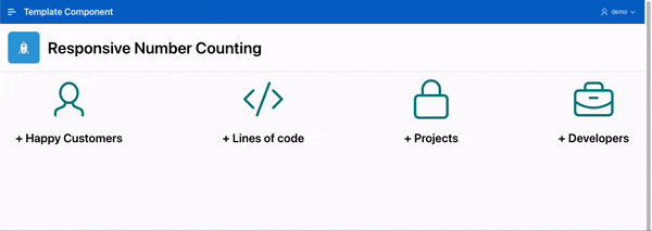
The article is a tutorial on how to create a Template Component in Oracle APEX. It explains how to build a responsive number counter, a reusable UI component, from scratch. The steps involve setting up an APEX application, creating the HTML, CSS, and JavaScript parts for the animated counter, and then incorporating the Template Component into the application. This process allows for extensive customization and improves the application's visual appeal and functionality. In the end it should look like this:
Give it a try!
Let´s create a Template Component from Scratch!
Before we can start we need an APEX application to create a Template Component. So, go ahead and log in to your APEX Workspace, then create a new application using the App Builder. Feel free to name it something like Template Component in the wizard.

The HTML Part
Once your APEX App is ready, go to the Shared Components and click on the Plug-ins link. The Create Plug-In Wizard will pop up. Choose From Scratch and click Next in the first step. Then give it a name, like Responsive Number Counting and choose the type Template Component.
Next, make sure to check both the SINGLE and MULTIPLE boxes because we want to have the option to show multiple counters. Now, APEX will automatically generate 3 HTML boxes with placeholders: PARTIAL, REPORT BODY, and REPORT ROW.

Replace the HTML code in the Partial Box with the code needed for the animated counter. The Content Division will display an icon and some text. We have three placeholders here:
ICONis where we'll define an icon for the counterTEXTshows the title for the counterVALUEdisplays the end number for the counter
Plus, we've got some CSS classes for customizing later on.
{if APEX$IS_LAZY_LOADING/}
  <div></div>
{else/}
    <div class="tc_col">
        <span class="tc_icon #ICON# fa-5x"></span>
        <h2 data-max="#VALUE#">+ #TEXT#</h2>
    </div>
{endif/}
Let's make some changes to the Report Body so we can customize it later and remove these bullet points. All we need to do is switch the <ul> to a <div> and add the CSS class like this:
<div class="tc_div">#APEX$ROWS#</div>
Finally, for the Report Row, we'll add a CSS class and change the <li> to a <div> like this:
<div class="tc_row" #APEX$ROW_IDENTIFICATION#>#APEX$PARTIAL#</div>
Now, it should look a something like this:

That's it for the moment! Just click Create Plug-In and you're all set for now. We'll move on to the CSS part in the next step.
The CSS Part
Once we've created the Template Component and clicked on it to make adjustments, we'll notice that we have more options available. If you scroll down, you'll see that APEX has generated 3 attributes, for example.

Scroll down a little bit more, and you'll find the Files section. This is where we'll create a CSS file to define our styling rules. So, go ahead and give that Create File button a click. Next, Create a file named responsive_counter.css and add the following:
.tc_icon {
  color: teal;
}

.tc_row {
  display: block;
}

.tc_col {
  display: flex;
  flex-direction: column;
  justify-content: center;
  align-items: center;
  padding-right: 15px;
  padding-left: 15px;
}

.tc_div {
    display: grid;
    grid-template-columns: 1fr;
}

@media
 (min-width: 1140px) {
    .tc_div {
        grid-template-columns: 1fr 1fr 1fr 1fr;
    }
}

@media
 (min-width: 600px) and (max-width: 1139px) {
    .tc_div {
        grid-template-columns: 1fr 1fr;
    }
}
With these CSS settings, you can let your creativity run as you want! In this example, we've set up a few basic rules to give the content a nicer shape and make it responsive. But feel free to do whatever you like 👍
Okay, now let's click Save Changes and click on Responsive Number Counting in the Breadcrumb to return to the Template Component. When you're there, scroll down to the files section. You'll notice our CSS file is all saved and minified! But keep in mind, the CSS file won't load just yet. So, let's copy the Reference of the Minified file and paste it into the File URLs to Load > Cascading Style Sheets section.

That´s it. We've set up the CSS rules and told the plug-in to load the file. But we also want to animate the counter, so we'll need some JavaScript. Let's move on to the next step where we'll add some JavaScript code. 🔥
The JavaScript Part
Now it's time to bring our Template Component to life. 🚀
What we have to do is to create another file where we placed our JavaScript Code. So, go ahead and give that Create File button another click. Next, Create a file named responsive_counter.js and add the following:
$(window).on('load', function(){

    function inVisible(element) {
        var WindowTop = $(window).scrollTop();
        var WindowBottom = WindowTop + $(window).height();
        var ElementTop = element.offset().top;
        var ElementBottom = ElementTop + element.height();

        if ((ElementBottom <= WindowBottom) && ElementTop >= WindowTop)
            animate(element);
    }

    function animate(element) {
        if (!element.hasClass('ms-animated')) {
            var maxval = element.data('max');
            var html = element.html();
            element.addClass("ms-animated");
            $({countNum: element.html()}).animate(
                {countNum: maxval},
                {
                    duration: 5000,
                    easing: 'linear',
                    step: function() {
                        element.html(Math.floor(this.countNum) + html);
                    },
                    complete: function() {
                        element.html(this.countNum + html);
                    }
                }
            );
        }
    }

    function start(){
        $("h2[data-max]").each(function() {
                inVisible($(this));
            });
    }

    $(window).scroll(function() {
        start();
    });

    start();
})
So, what's happening here? First, we want to start the animation only when we can see the counter. To do that, we check if the counter is visible after the page loads and every time we scroll. If the counter is in view, we start the animation. Now, we go through each counter. They all begin with 0 and end at the variable
maxval, which gets its value from thedata-maxattribute or let me say the VALUE placeholder. The calculation is linear, ensuring that each counter finishes at the same time.
Again click Save Changes and click on Responsive Number Counting in the Breadcrumb to return to the Template Component. When you're there, scroll down to the files section. You'll notice our JS file is all saved and minified! But again keep in mind, the JS file won't load just yet. So, let's copy the Reference of the Minified file and paste it into the File URLs to Load > JavaScript section and click Apply Changes.

We're all done. That's it for the Template Component. The next and final step is to include the Template Component in our APEX Application.
The APEX Part
Go back to the page where you'd like to add the Template Component (in my example, Page 1). You'll notice that we now have a new Region Type called Responsive Number Counting. That´s the Template Component just created! So, let´s go ahead and create a new Region named Responsive Number Counting with a Type of Responsive Number Counting.

For the SQL Source, let's try using the following code as an example. This will help you get a sense of how it all comes together:
Select 1 as sort,
       50 as "Value",
       'Happy Customers' as "Text",
       'fa fa-user' as "Icon"
  from dual
union
Select 2 as sort,
       10000 as "Value",
       'Lines of code' as "Text",
       'fa fa-code' as "Icon"
  from dual
union
Select 3 as sort,
       20 as "Value",
       'Projects' as "Text",
       'fa fa-lock' as "Icon"
  from dual
union
Select 4 as sort,
       50 as "Value",
       'Developers' as "Text",
       'fa fa-briefcase' as "Icon"
  from dual
 order by 1;
Next, switch to Attributes and match up the Columns with the Placeholders like this:

That's it, there's nothing more to do! ✅
Test the Template Component
Alright, now it's time to test our Template Component! Just click the Save and Run button and see how it works. If everything goes smoothly, it should look something like this:

Fantastic! It works perfectly, and my first Template Component is all set to take on the world 🌍
Conclusion
In conclusion, we dived into the process of creating a Template Component in Oracle APEX. We explored how to utilize the HTML, CSS, and JavaScript features to build a dynamic, animated counter. This not only enhances the visual appeal of the application but also adds a functional aspect that can be customized to fit various data display needs. The journey of creating a Template Component from scratch offered a deep understanding of the potential of APEX's Template Components and how they can be used to create reusable UI components. This knowledge can be leveraged to further enhance your APEX applications and create more sophisticated UI/UX designs.